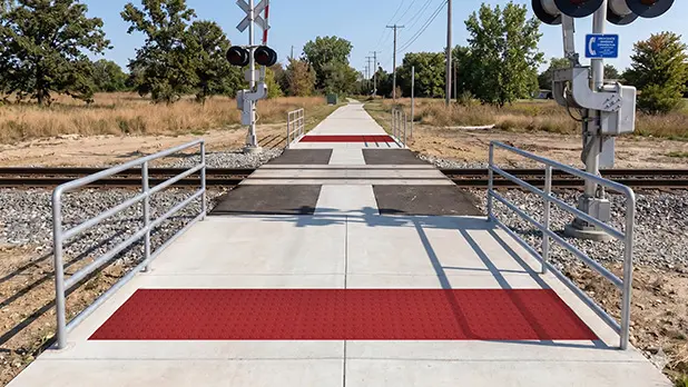
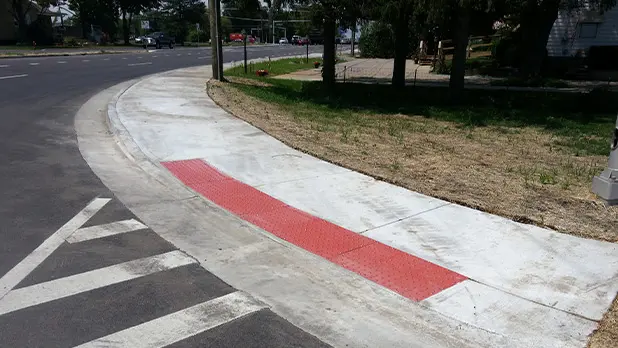
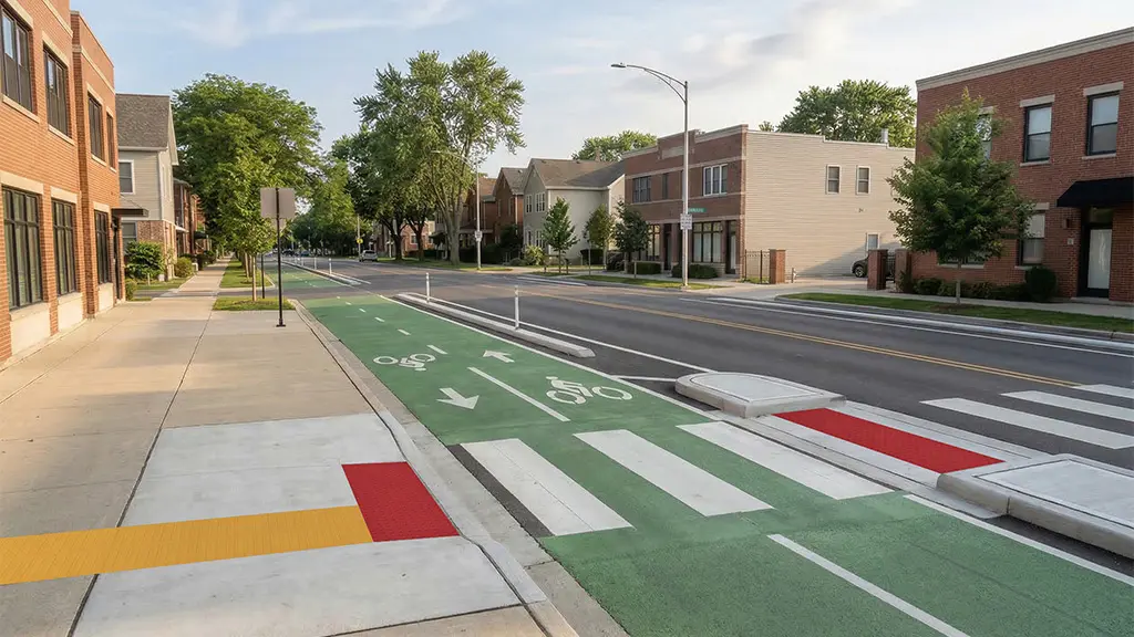
A detectable warning surface is designed to be recognized tactually, but touch is only part of the accessibility equation. Many people who are legally blind retain usable vision and use visual information alongside a long cane, environmental cues, or other wayfinding methods.
That makes detectable warning surface contrast an important part of product and color selection. The goal is not to choose one universally “accessible” color; it is to create sufficient visual distinction between the warning field and the walking surface around it.
Detectable Warnings Are Both Tactile and Visual
The truncated domes provide the standardized tactile warning. Visual contrast provides an additional cue for pedestrians who can use residual vision.
Research into tactile walking surfaces has found luminance contrast to be an important factor in visual detection and conspicuity. Applicable U.S. criteria address this through a light-on-dark or dark-on-light relationship between the detectable warning and the adjacent walking surface.
That relationship is the key. A tile color cannot be evaluated effectively without considering what surrounds it.
Contrast Is About Relationship, Not a Universal Color
Yellow is strongly associated with detectable warnings and has performed well in research, particularly against darker pavement. But there is no single federal “ADA yellow” requirement that applies to every detectable warning installation.
A light warning surface can contrast against dark pavement. A darker surface may provide contrast against light concrete.
State, local, transportation-agency, or owner requirements may be more specific, so the applicable project criteria still need to be verified.
Why Matching the Surrounding Concrete Can Be a Problem
Architectural design often favors materials that coordinate closely with surrounding paving. For an accessibility feature, however, making a detectable warning visually disappear can work against its intended function.
A warning surface that closely matches the adjacent pavement may provide insufficient visual distinction even if its truncated-dome geometry is correct.
Color and finish should therefore be coordinated early enough that accessibility and architectural goals can be addressed together rather than after products have already been ordered.
Material Affects the Finish Strategy
Different detectable warning materials establish color in different ways.
Polymer
TufTile’s polymer uses homogeneous color through the material rather than relying solely on a surface coating.
Galvanized Steel and Cast Iron
TufTile’s metallic detectable warning products can be supplied with powder-coated finishes, and certain products may also be available in natural or unfinished appearances.
Regardless of material, the selected finish needs to be evaluated against the adjacent walking surface and any project-specific color requirements.
Weathering and Maintenance Can Change Appearance
Contrast is not something to consider only on installation day.
Dirt, salt, surface wear, staining, patina, fading, repairs, and changes to surrounding pavement can alter the original light-dark relationship over time. Resurfacing or recoating adjacent pavement can also change whether the warning field remains visually distinct.
Routine maintenance should therefore preserve both the physical condition of the truncated domes and the visibility of the warning surface. Periodic inspection can identify situations where cleaning, repair, recoating, or other maintenance is needed.
Contrast Is One Part of a Compliant Surface
Strong visual contrast cannot compensate for incorrect dome dimensions, spacing, placement, or warning-field size.
The reverse is also true: technically correct truncated domes still need to satisfy the applicable visual-contrast criteria.
Detectable warning surfaces work as complete systems. Geometry, placement, dimensions, contrast, material, and installation all need to be considered together rather than treated as independent boxes to check.
Choose Color With Context
The most useful way to evaluate detectable warning colors is against the actual—or accurately represented—adjacent pavement.
Samples can help project teams compare the relationship among the tile, surrounding concrete or paving, and anticipated lighting conditions before the final finish is selected. TufTile offers multiple colors across its detectable warning product lines and provides product samples for this purpose.
The question is not simply “What color should the DWS be?” It is “Will this warning surface remain clearly distinguishable from the walking surface around it?”